Visualization of P-Values
Array Studio also includes a number of other views, specifically for visualizing p-values after running an analysis. For this tutorial, we will investigate the p-values generated by the quantitative trait analysis in the previous chapter. Specifically, this includes ChromosomeView, HistogramView, PvaluePlotView, GenomeView, and RegionView. As we already discussed the ChromosomeView in the previous chapter, it will not be discussed again here. But, feel free to investigate the ChromosomeView again on your own.
HistogramView
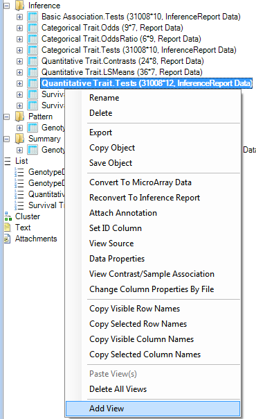
Add a HistogramView to the Quantitative Trait.Tests table in the Inference section of the Solution Explorer. Right click on Quantitative Trait.Tests, and choose Add View. Choose HistogramView from the list.
Once the view is open, it will look similar to the following.
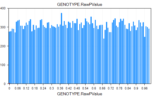
On the x-axis is the p-value, while the y-axis is the count of each p-value.
To change the column used for the p-value, use the Specify Histogram Columns option in the Task tab of the View Controller.
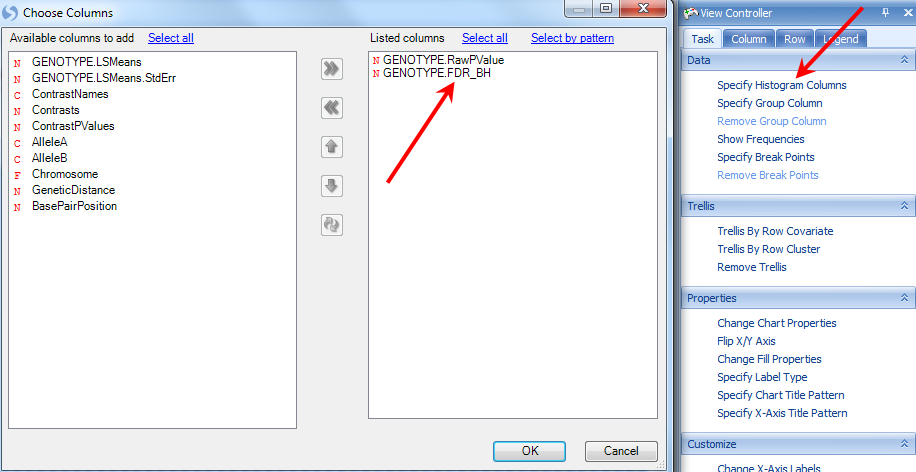
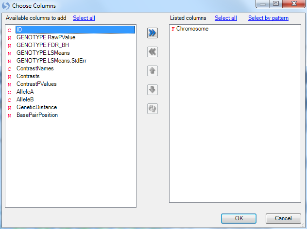
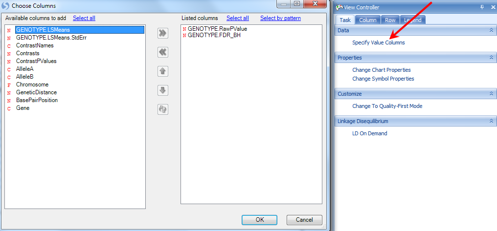
This opens the Choose Columns window. Add GENOTYPE.FDR_BH to the Listed columns and click OK to return to the view.
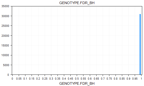
Notice now that there are 2 charts in the view. Scroll to the chart to see the initial HistogramView for the adjusted p-values.
Filtering on p-values can reveal more significant ones in this view. Try this now, by filtering the GENOTYPE.FDR_BH to those markers less than 0.05 (enter "<0.05" into the GENOTYPE.FDR_BH filter).
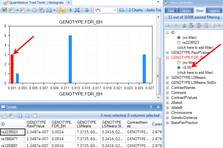
Click on any bar in the HistogramView to see the details of variables in that bar. Selected bars are highlighted in red. Notice that the Details window is updated to show the selected variables.
PValuePlotView (PValueQQPlot now)
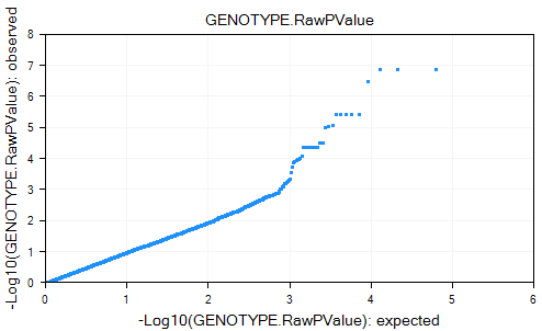
Besides the HistogramView, Array Studio provides a PValuePlotView for looking at analyzed data. Add this view to the Quantitative Trait.Tests table by adding it in the usual manner. Once added, it should look similar to the screenshot below. If you have an active filter (e.g. raw-pvalue < 0.05), reset the filter now.
The PvaluePlotView plot the expected p-value versus the observed p-value and can be used for examining the distribution of the p-value results.
In this view, the x-axis shows the Log10 of the expected PValue, while the y-axis shows the Log10 of the observed PValue.
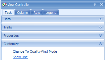
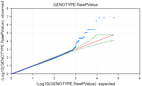
The expected p-value line can be drawn by clicking the Show Line option in the Customize section of the Task tab of the Solution Explorer.
The view is updated with the expected p-value line in red and the 95% confidence interval values in green. It appears from this graph the observed p-values do deviate from the expected distribution.
Other options in the Task tab of the View Controller include removing the Log10 transformation from the graph, and specifying which columns to be used as p-value columns. Like all the other views in Array Studio, PValuePlot view is also fully interactive.
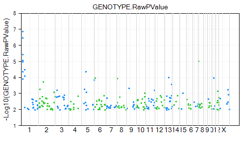
GenomeView
Another view that can be added is the GenomeView. In this view, the x-axis represents the whole genome, while the y-axis represents the p-value. The user can set a specific p-value cutoff for visualization (by default 0.01).
Add a new GenomeView to the Quantitative Trait.Tests table now. When added, it should look similar to the screenshot below. Points shown by default have p-value < 0.01.
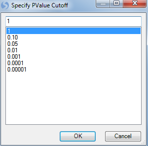
To change the P-value cutoff, click the Specify PValue Cutoff in the Task tab of the View Controller.
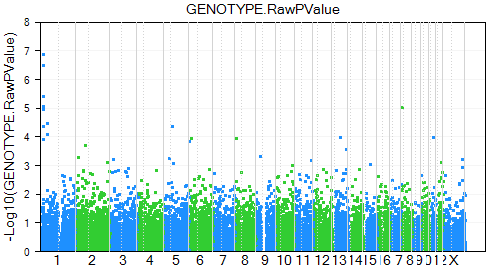
This opens the Specify PValue Cutoff window. The user can either choose one of the preset p-values, or enter the value in the box. Change the PValue cutoff to 1 in order to display all data points. Click OK to continue.
The graph is updated. Note that by default the symbols are colored by chromosome. This works well, as the user can easily distinguish between the data points on each chromosome.
Finally, the user can also trellis the chart by chromosome, so that each chart represents one chromosome. Do this by selecting the Trellis By Row Covariate option in the Task tab of the Solution Explorer.
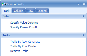
This opens the Choose Columns window. Add Chromosome to the Listed Columns and click OK to trellis the chart by chromosome.
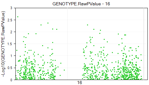
The view is updated so that there is one chart per chromosome. In total, there are 32 charts.
The chart of chromosome 16 is shown below.
Region View
Another view that can be added is the RegionView. In this view, the user can use the latest Ensembl build to visualize their results across the chromosomes. In addition, they can easily find particular genes of interest and automatically zoom to that region.
Clear all filters on the Quantitative Trait.Tests report now.
Add a new RegionView to the Quantitative Trait.Tests table now. When added, it should look similar to the screenshot below.
Note: The first time a RegionView is added, it may take a few minutes to download the Ensembl and Hapmap information.
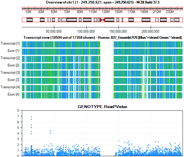
The RegionView contains multiple parts. Each part is fully interactive, and contains options that can be accessed by right-clicking.
The first section is the Overview of the chromosome. The chromosome in view can be set, either by manually setting the Start and End points or by using the zoom in and zoom out.
For the Overview section, the user can right-click to switch between panning and zoom modes. Selecting particular sections of the chromosome will zoom in the main view.
The next section contains the cytoband for that chromosome.
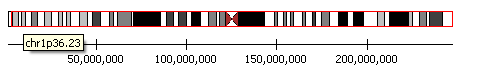
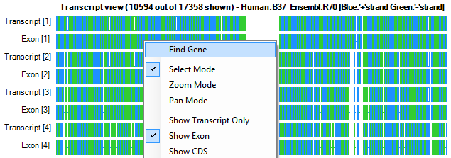
The next visible section is the transcript view. This will show the names of the transcripts for the currently visible region. It becomes very useful as you zoom in. Again, right-clicking allows a number of options.
Right click on that region and choose Find Gene from the dropdown box.
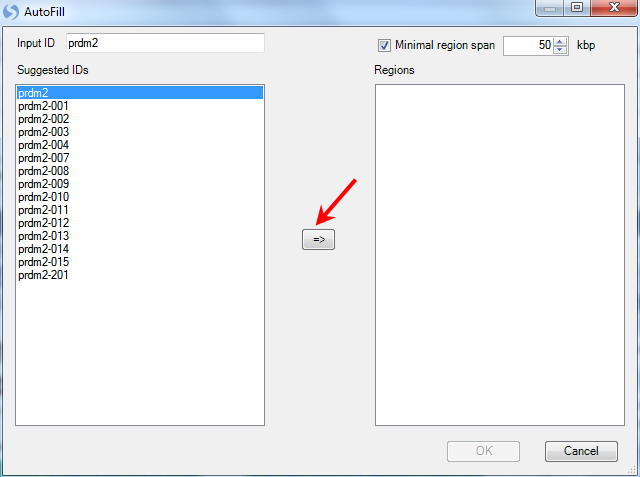
This opens the Autofill window where the user can search for their gene of interest. Type Prdm2 and move it over to the right-hand side, and then choose the region. Click OK to continue.
The transcript view is now zoomed to the region of PRDM2, where the user can visualize all the p-values associated with this region. The current chromosome region we are viewing is highlighted in red on the cytoband.
Again, all of these sections can be further customized by using right-click, and switching between modes.
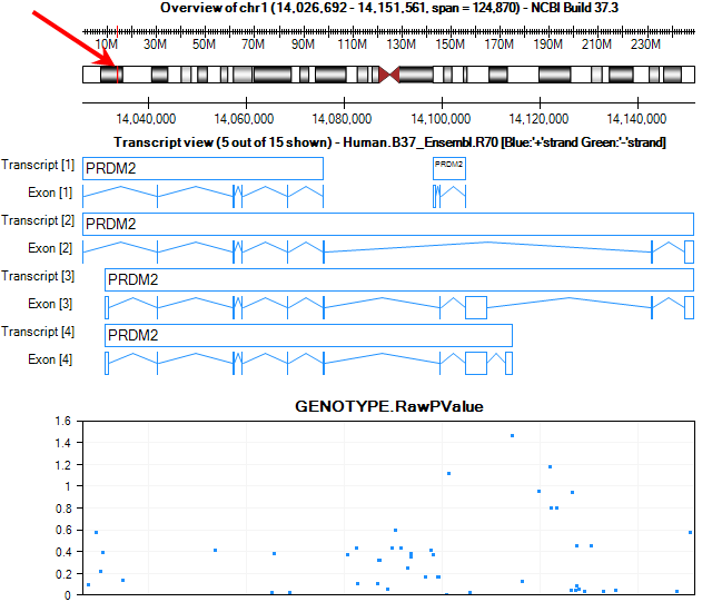
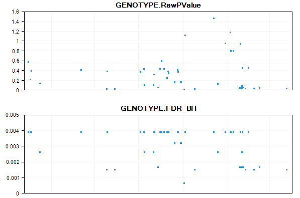
By default, the main view will contain 1 chart of p-values. The x-axis is the position of the chromosome, while the y-axis shows the Log10 Pvalue. Use the Specify Value Columns from the Task tab of View Controller to display more numerical columns.
Add GENOTYPE.FDR_BH from the left panel to the right Listed columns panel. The main view is updated to have 2 parallel plots.
Congratulations! You have now explored your results of your analysis, using a number of different visualizations.